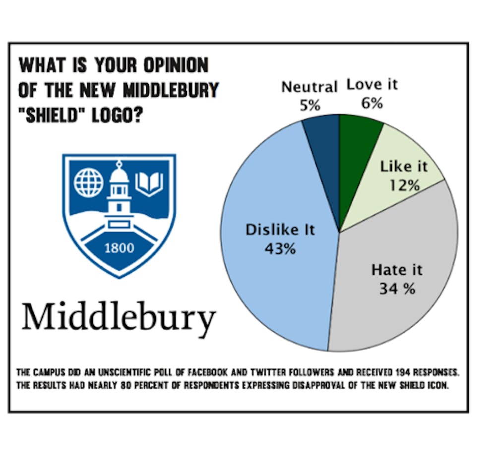
On Jan. 7, President of the College Ronald D. Liebowitz announced the launch of Middlebury’s new brand identity system. In an email to students, Liebowitz explained that the new system intends to clarify what had been a somewhat unclear relationship between the undergraduate institution and the other Middlebury schools and programs, such as the language schools, Bread Loaf and Monterey.
Vice President for Communications and Marketing Bill Burger explained that it became clear that this ambiguity needed to be addressed in 2012.
“We hired a consultant to conduct the research,” Burger explained, “both qualitative and quantitative research, to find out how people perceived Middlebury. We learned a lot from this about how those perceptions aligned with how we saw ourselves.”
One thing that stood out during this research was that there were some misconceptions regarding how the schools and programs at Middlebury fit together. Burger noted that this issue had also come up previously, in the 2010 reaccreditation of the College.
Burger believes that the new identity system will help make the College better known. “Our lack of a clear and shared identity actually served to suppress awareness of Middlebury,” he said. “Many people know about the College, but they didn’t necessarily know that our other schools and programs, which they also may have heard of and which are so respected, are actually connected to Middlebury. Our primary goal is to make it clear that the Bread Loaf School of English, the Language Schools, the Institute in Monterey and the rest are part of one institution, all part of Middlebury.”
In addition to the new naming system, a new logo was also introduced. Burger reflected on the process, saying that the initial plan did not include a logo. Ultimately, however, it became clear that a visual was needed to tie everything together. While Burger admitted that the Middlebury seal was familiar, it also had some disadvantages. He noted its intricacy, making reproduction difficult at times, but also that the text contained abbreviated Latin.
“We needed something bolder,” Burger stated, which is how the shield came to light. “We began to focus on those elements we thought were important to emphasize and that most reflected what is distinctive about Middlebury,” he said, which included its international focus, sense of place and academics, along with the date of the founding.
In terms of difficulties faced throughout the process, Burger explained maintaining tradition in the new logo was important. “That’s why you see Old Chapel, the book, the mountains, the globe, and the founding date,” Burger said.
Burger referenced Middlebury’s 2007 attempt at a new logo – a maple leaf, which ultimately failed. “The problem with the so-called maple leaf logo,” he reasoned, “was that it didn’t really honor the traditions of the institution. It didn’t resonate with alumni or with students. When we embarked on this project, we knew we needed to take a different approach, you could call it a conservative approach, that incorporated familiar symbols.”
Reception to the new identity system, Burger says, has been supportive.
“I have read at least 100 comments that have come in through email, Facebook, Twitter, or through the form that we created on the website.” Burger revealed. “Overall, the reaction has been overwhelmingly positive.”
However, several alumni on the Facebook page expressed disappointment with the new logo and rebranding. These graduates voiced frustration that last week’s announcement was similar to the 2007 maple leaf rollout (which recieved such negative feedback that it was ultimately discarded), where they felt removed from the process.
Likewise, in a Campus poll that asked for feedback on the new logo, 44 percent of the 194 respondents indicated that they “dislike” the new logo while 34 percent said that they “hate” it.
Students also took to forums such as YikYak to express their disappointment in the new logo. One such anonymous “Yak” read, “Sh***y tailgates and stupid logos...One day we woke up and they were just there without explanation.”
Addressing the two different components of the transformation, Burger said that he hasn’t yet heard anyone express disdain over the naming system.
“I’m sure some people will take issue with the particular design of the logo,” Burger said. “Whenever you introduce a new graphic symbol, no matter what it is, some people won’t like it initially, or perhaps ever. That comes with change. But already I’ve heard from a few people who said they had a negative initial reaction, but began to like it more after seeing it for a day or two.”


